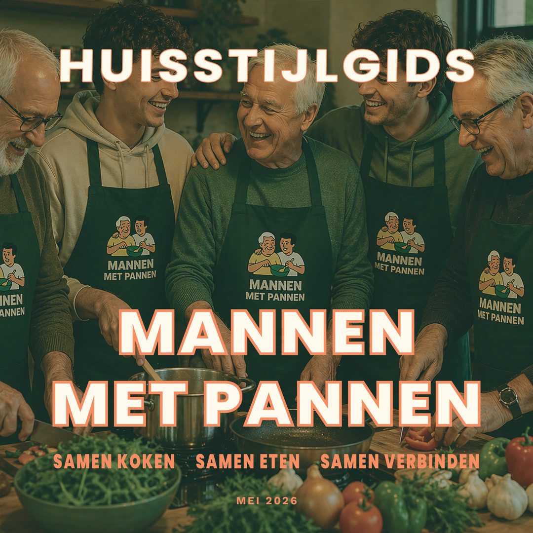
Visual identity developed for Mannen met Pannen, reflecting cooking, shared meals and intergenerational connection.
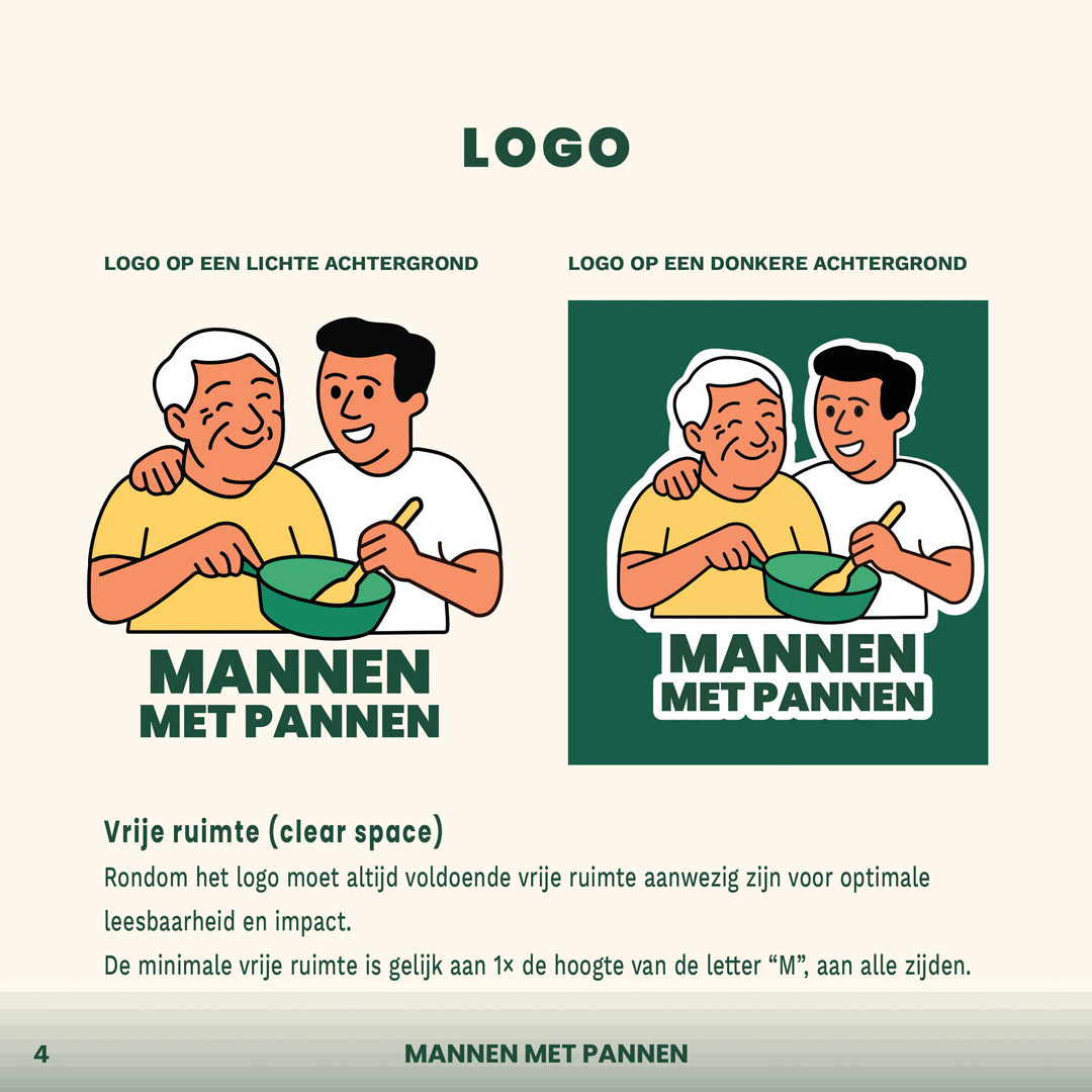
The existing Mannen met Pannen logo carefully reconstructed and converted into a scalable vector format.
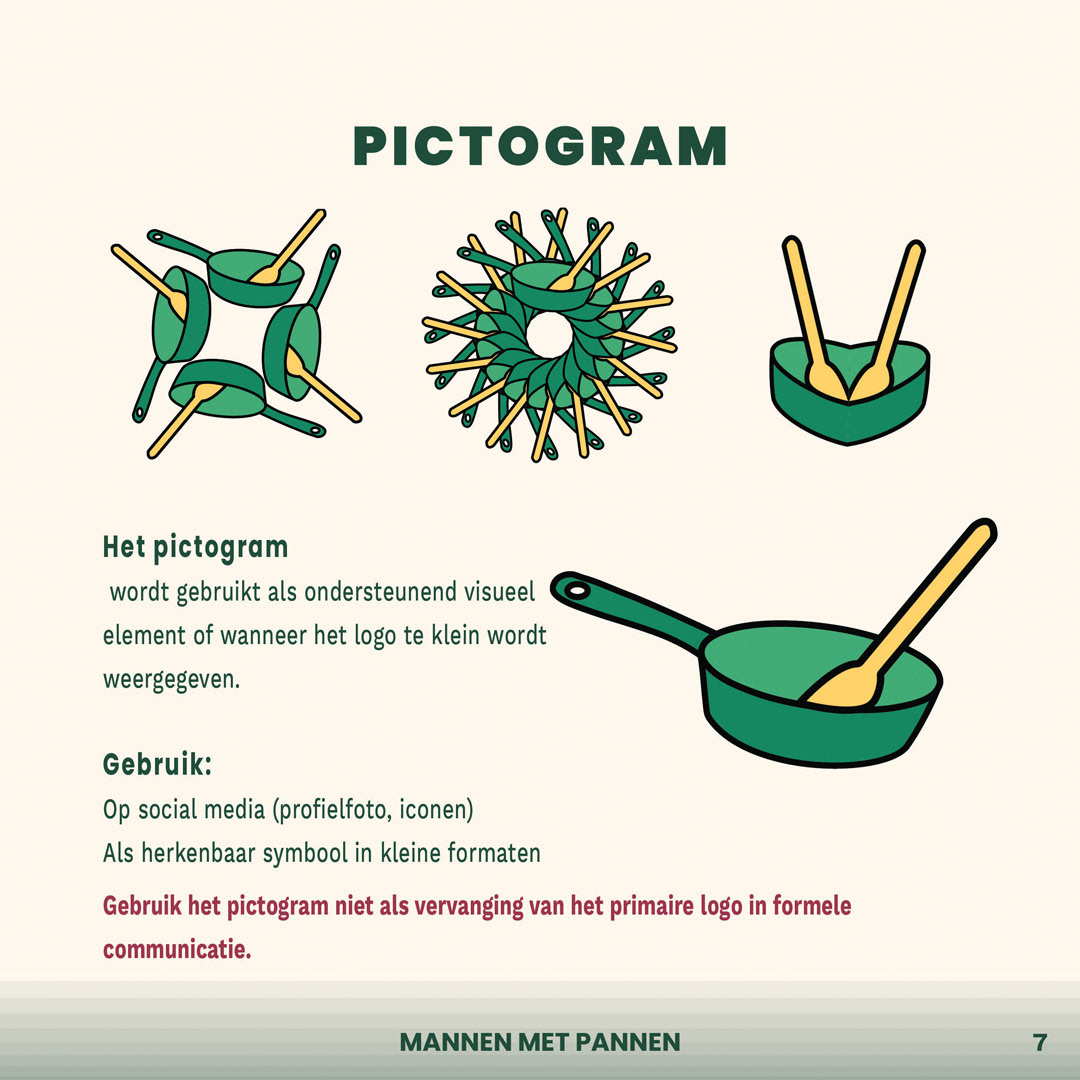
Vector construction of the existing Mannen met Pannen logo, preserving its original characters and recognisable style.
Mannen met Pannen logo variations prepared for consistent use across digital and printed communication.
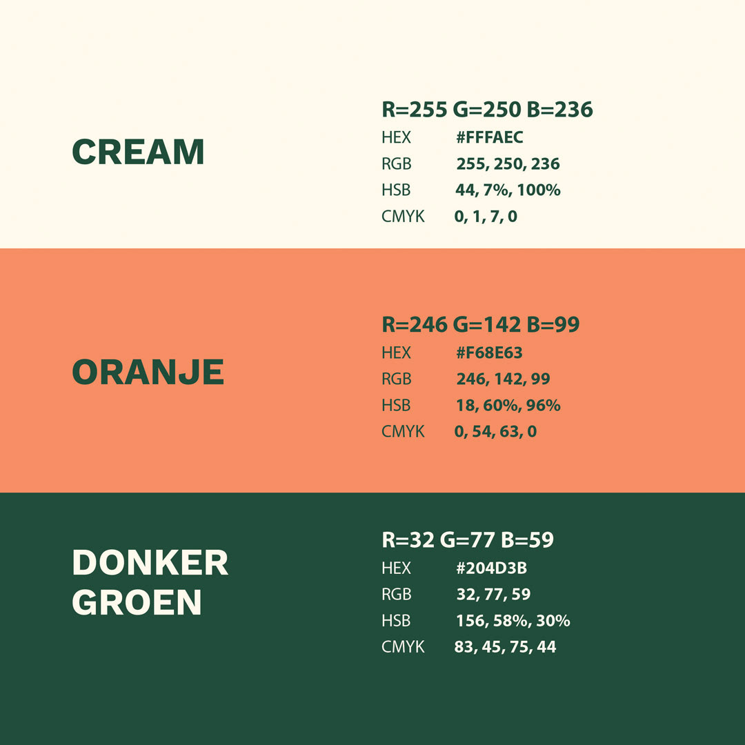
Warm and welcoming colour palette developed for the Mannen met Pannen visual identity.
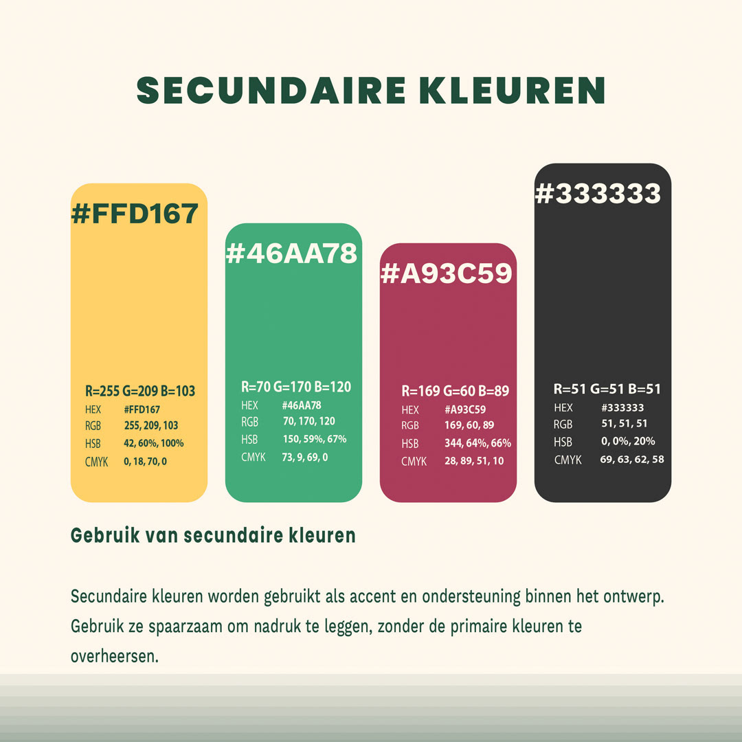
Brand colour combinations designed to create consistency, recognition and an inviting visual character.
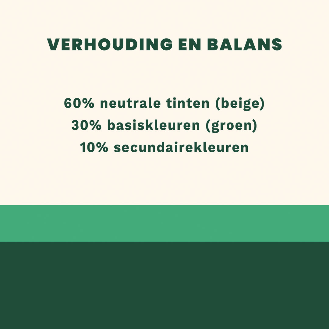
Reconstructed Mannen met Pannen logo shown at different sizes to demonstrate clarity and scalability.
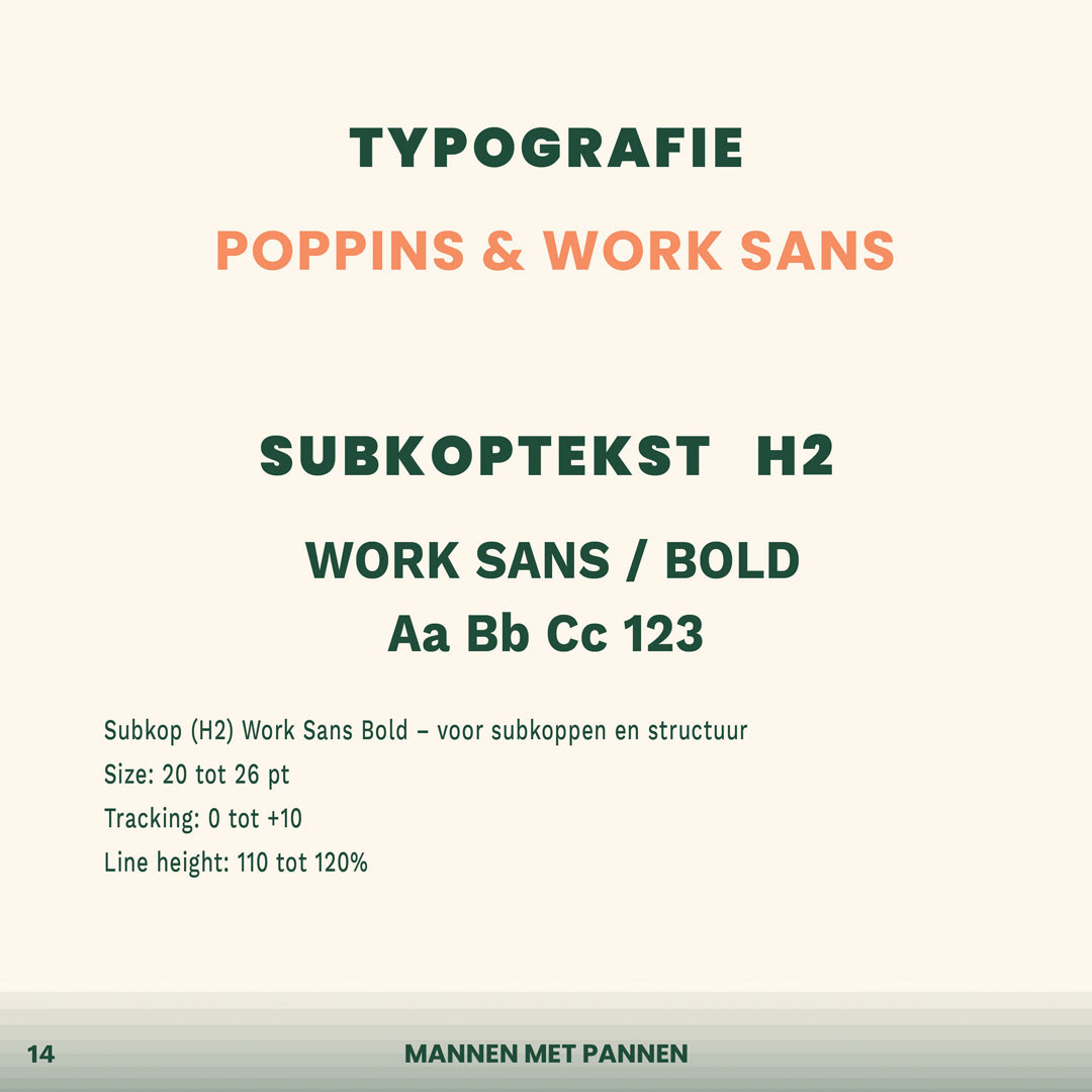
Typographic system developed for clear and consistent Mannen met Pannen communication.
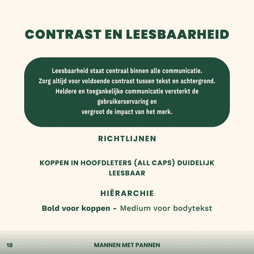
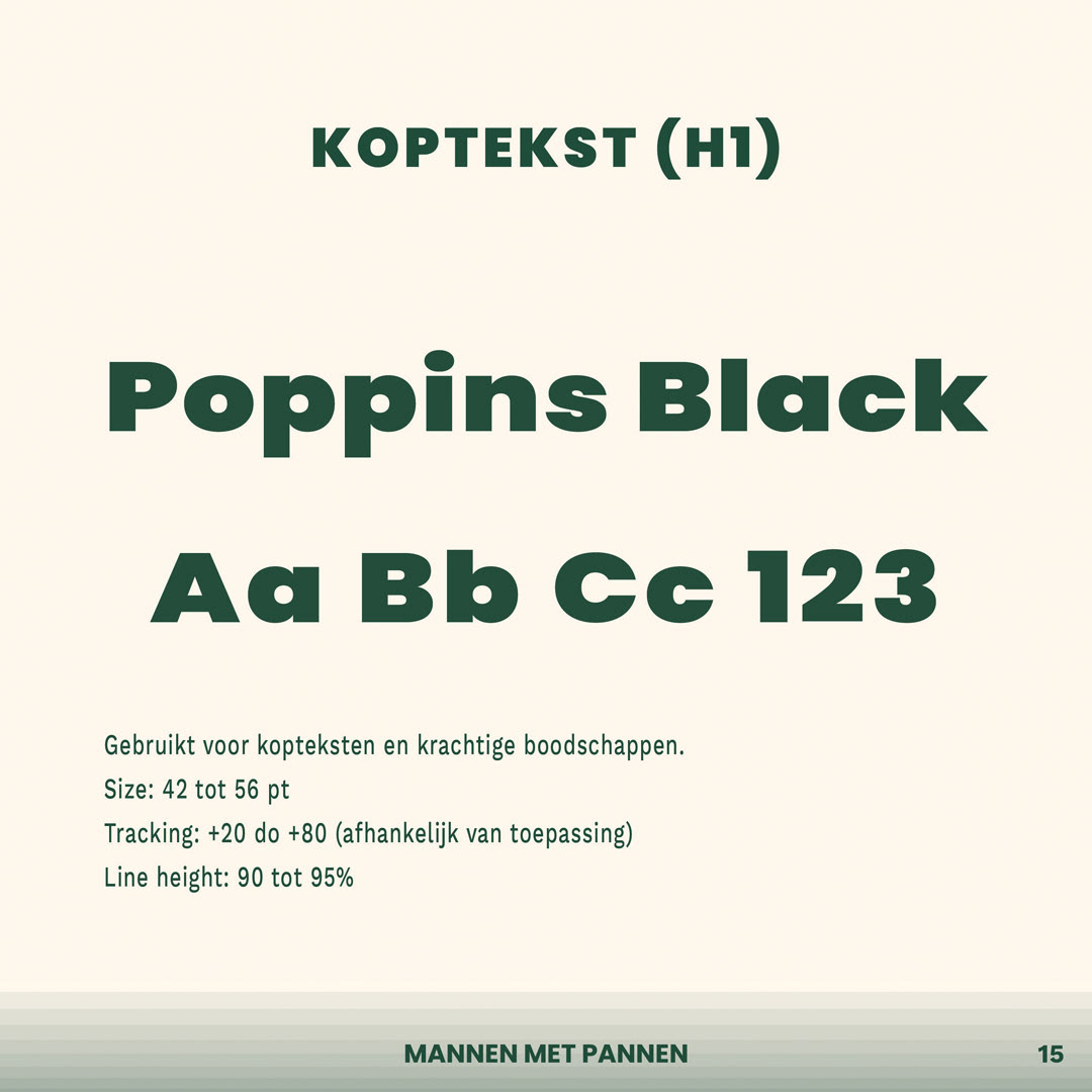
Typography hierarchy showing the use of headings, supporting text and body copy within the brand identity.
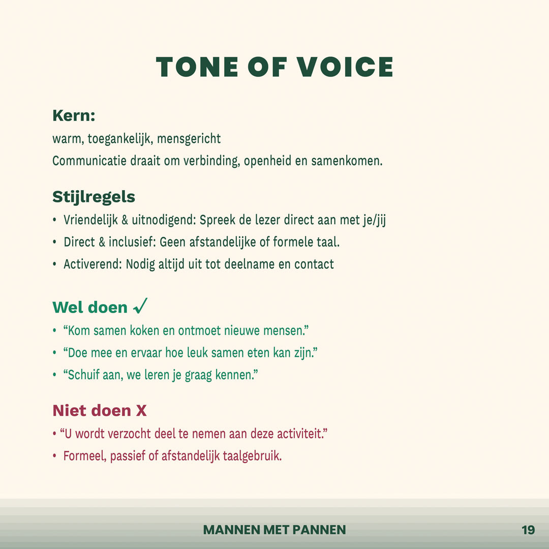
Application of the Mannen met Pannen visual identity across social media and printed communication materials.
MANNEN MET PANNEN
Brand Identity · Visual Communication
Mannen met Pannen is a Groningen-based foundation that brings men aged 55 and over together with students through cooking and shared meals.
Under the motto “Cook together, eat together, connect together”, the initiative encourages meaningful encounters and creates new social connections between generations.
THE STARTING POINT
The existing logo served as the foundation for the new visual identity. I carefully reconstructed and vectorised the logo, preserving its familiar character while making it suitable for consistent use across different formats, both digitally and in print.
THE APPROACH
Building on the reconstructed logo, I developed the colour palette, typographic system, tone of voice, graphic elements and visual guidelines.
The new brand language translates the warmth, openness and social purpose of the foundation into a coherent and recognisable visual identity.
Clear grid systems, typographic hierarchy and consistent design principles create an identity that feels personal, accessible and inviting.
THE RESULT
The final identity reflects the sense of connection that develops around a shared table.
It provides Mannen met Pannen with a flexible visual system that can be applied consistently across social media, printed materials and other forms of communication while preserving the foundation’s warm and recognisable character.
MY ROLE
- Reconstruction and vectorisation of the existing logo
- Development of the visual identity
- Colour palette and typographic system
- Tone of voice and graphic elements
- Guidelines for social media and print
- Grid systems and visual consistency
- Development of the visual identity
- Colour palette and typographic system
- Tone of voice and graphic elements
- Guidelines for social media and print
- Grid systems and visual consistency