

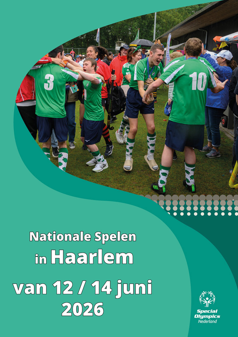
Overview of the flexible visual system developed for Special Olympics Netherlands within its established brand identity.
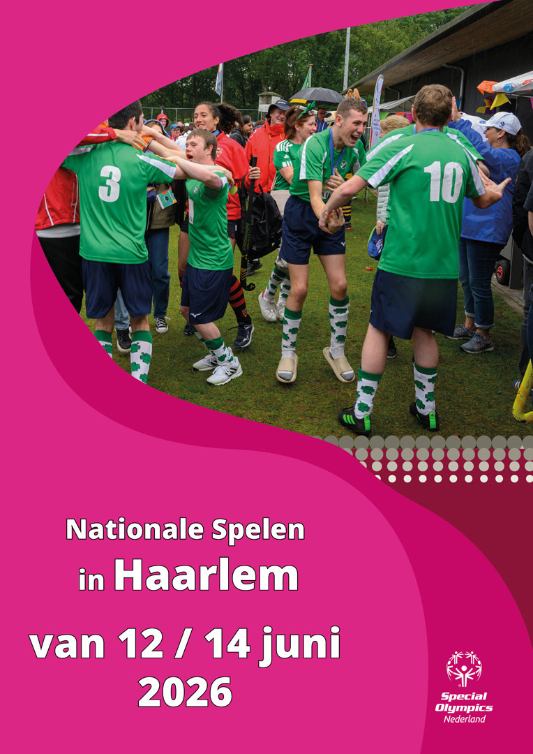
Poster composition combining athlete photography, bold colour fields and recognisable Special Olympics graphic elements.
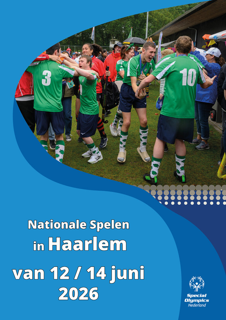
Alternative poster design demonstrating how the modular elements adapt to a different colour palette and composition.
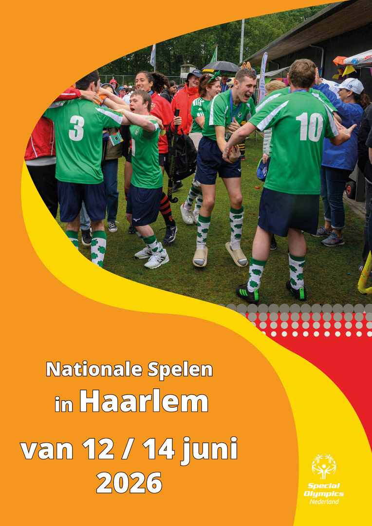
Collection of flexible graphic elements designed for consistent use across future poster and digital communications.
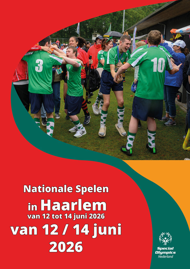
Visual composition placing emotion, movement and human connection at the centre of the design.
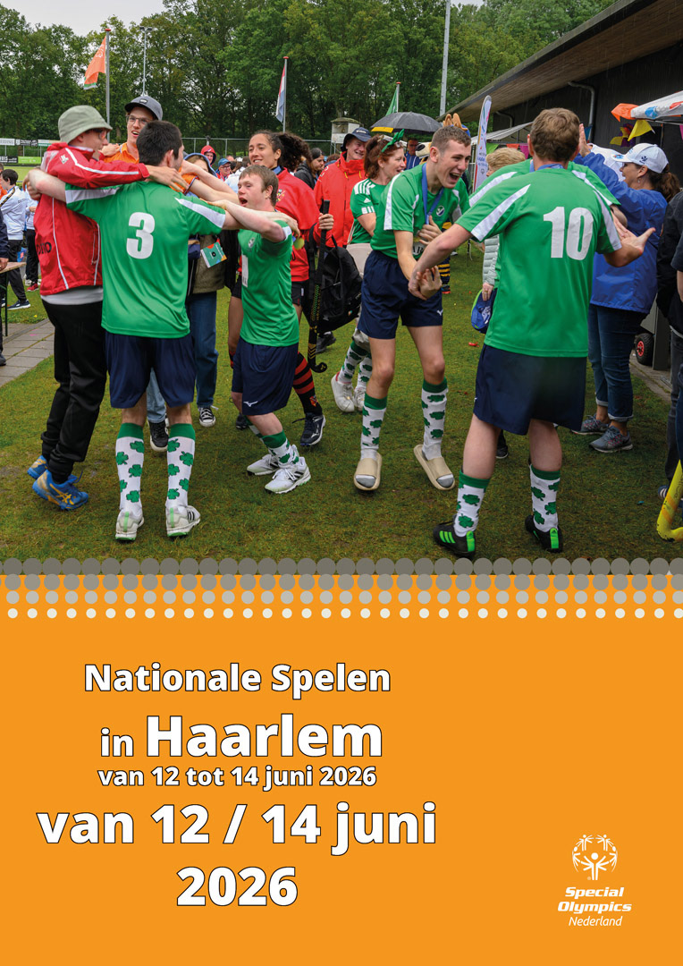
Digital communication formats using adaptable typography, photography and modular graphic elements.
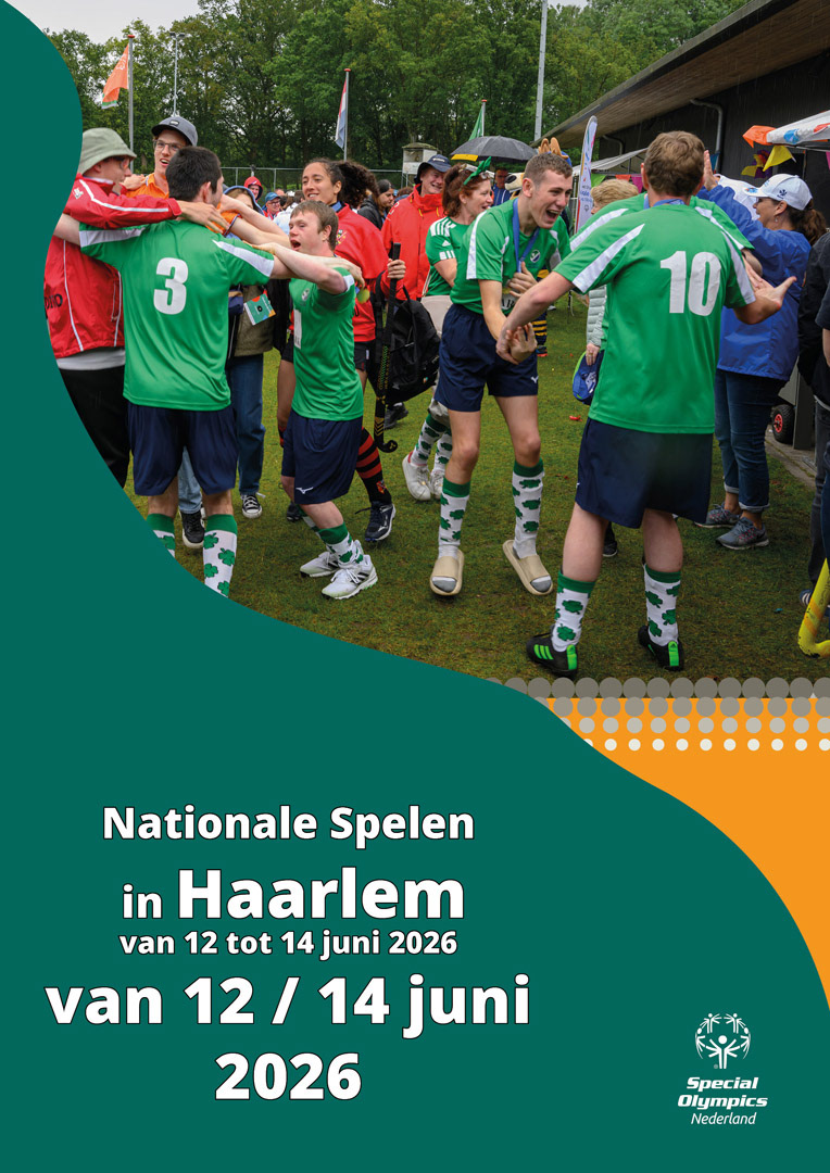
Final overview of the poster and digital applications created for the Special Olympics Netherlands visual system.
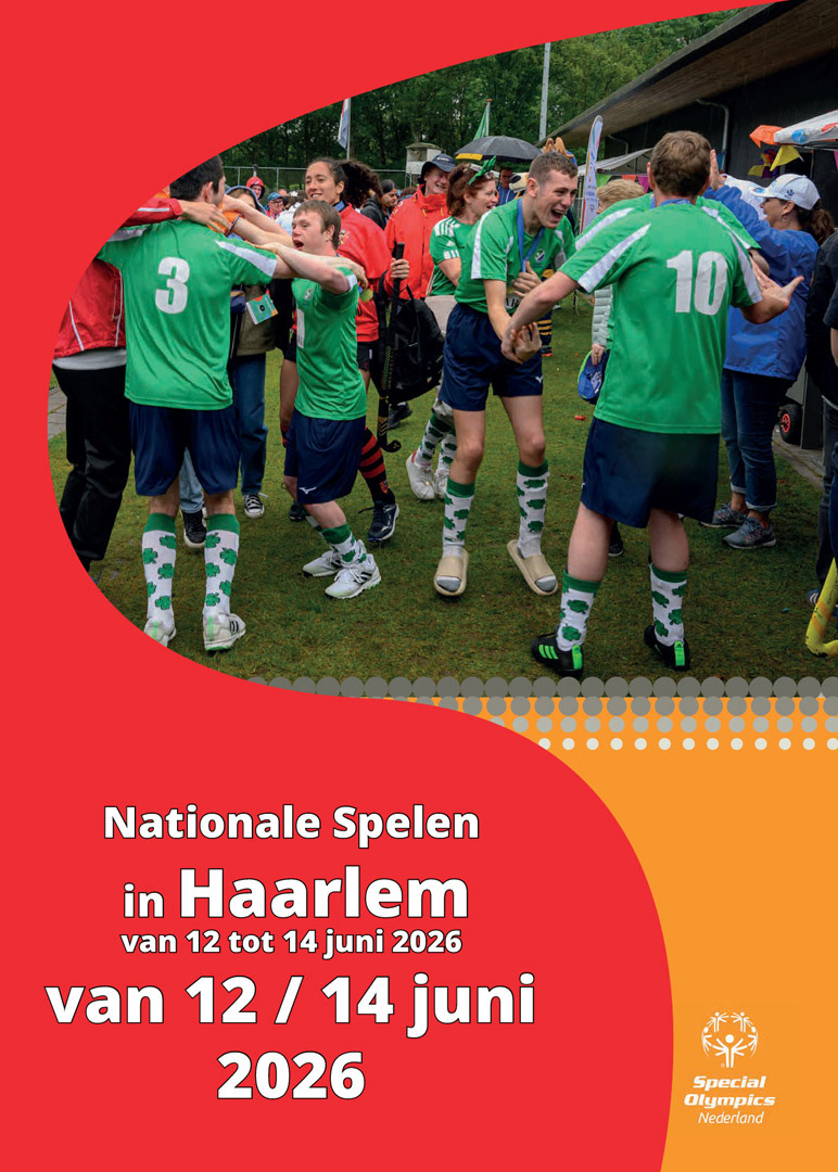
Colour variations showing how the graphic system maintains a consistent and recognisable brand appearance.
SPECIAL OLYMPICS NETHERLANDS
Flexible Visual System
Visual Design · Brand Application
Visual Design · Brand Application
For Special Olympics Netherlands, I developed a series of flexible visual elements for future poster designs and digital communications. The work was created within the organisation’s established and clearly defined brand identity.
The main challenge was adapting individual graphic elements across different colour systems, compositions, and formats without compromising brand recognition or visual consistency. To achieve this, I developed a modular system in which the elements can be combined, repositioned and scaled for different communication materials.
People are at the heart of the visual approach. By placing emotion, movement and human connection at the centre of the design, the visual elements support the inclusive, positive and energetic character of Special Olympics Netherlands.
The result is a flexible and recognisable visual system that can be used consistently across future poster designs and digital applications.
MY ROLE
- Visual concept development
- Design within established brand guidelines
- Development of flexible graphic elements
- Adaptation to different colour systems
- Application across different formats and compositions
- Emphasis on emotion, movement and human connection
SOFTWARE
- Adobe Illustrator
- Adobe InDesign