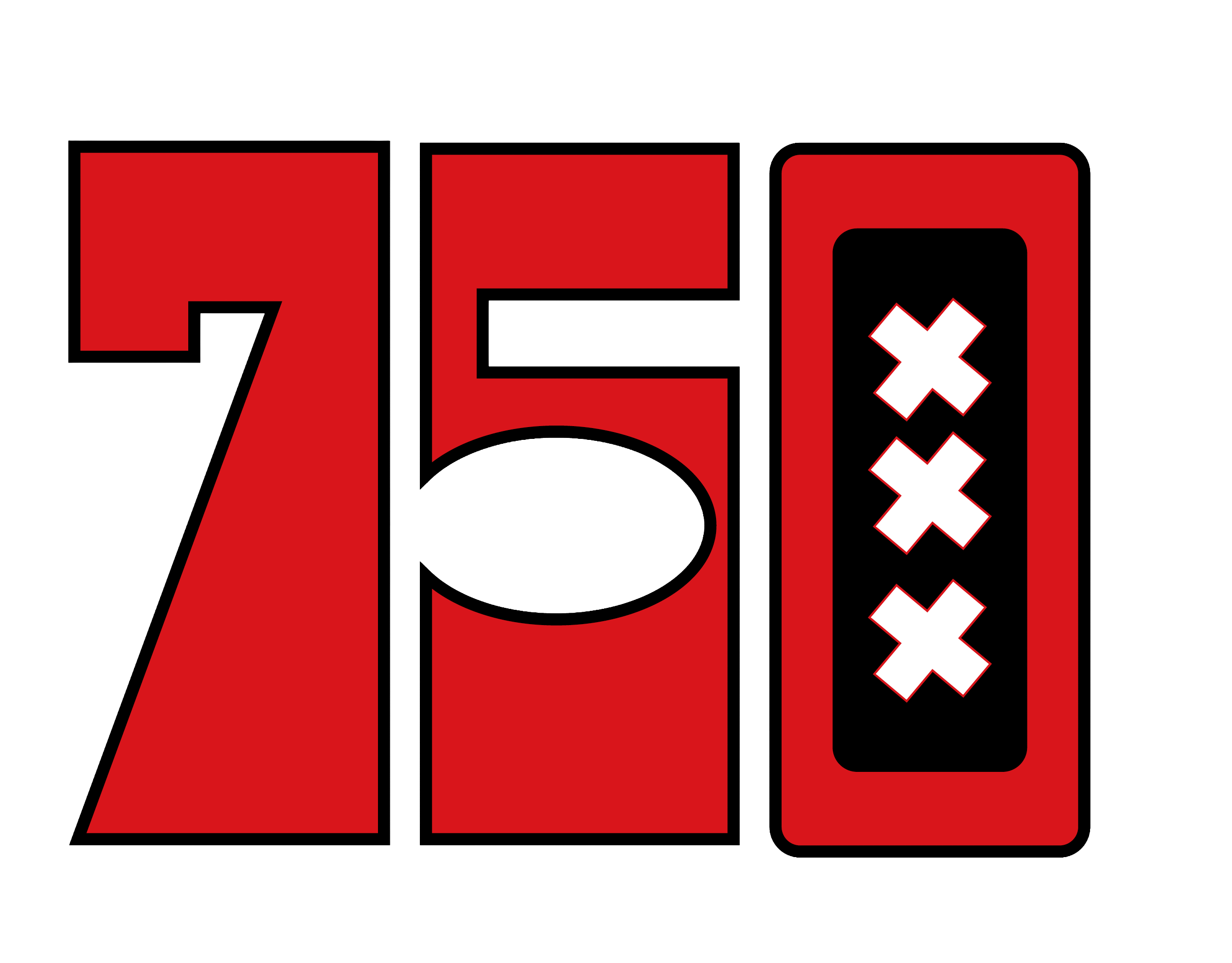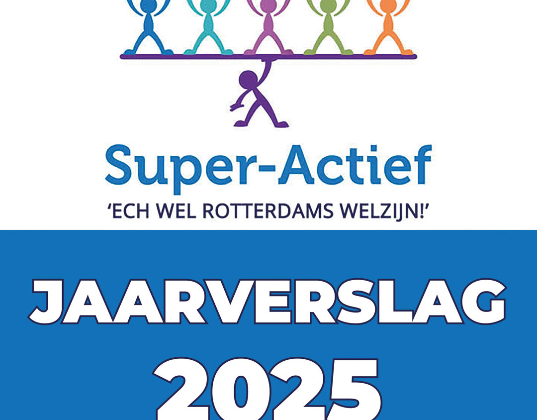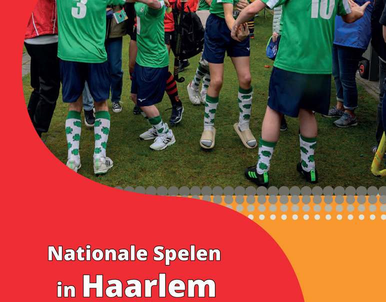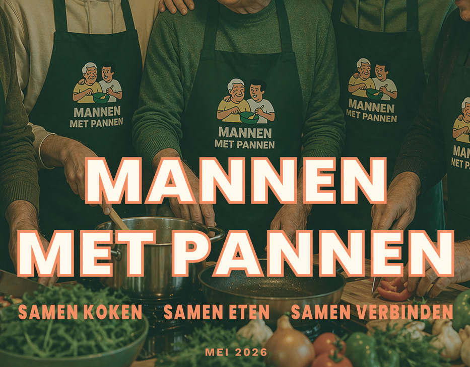

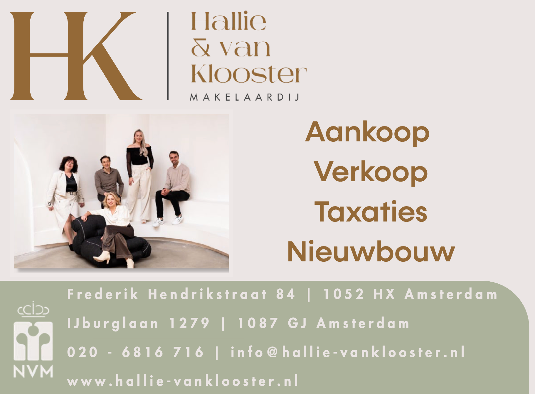
BEFORE — Original advertisement published in De Brug Amsterdam
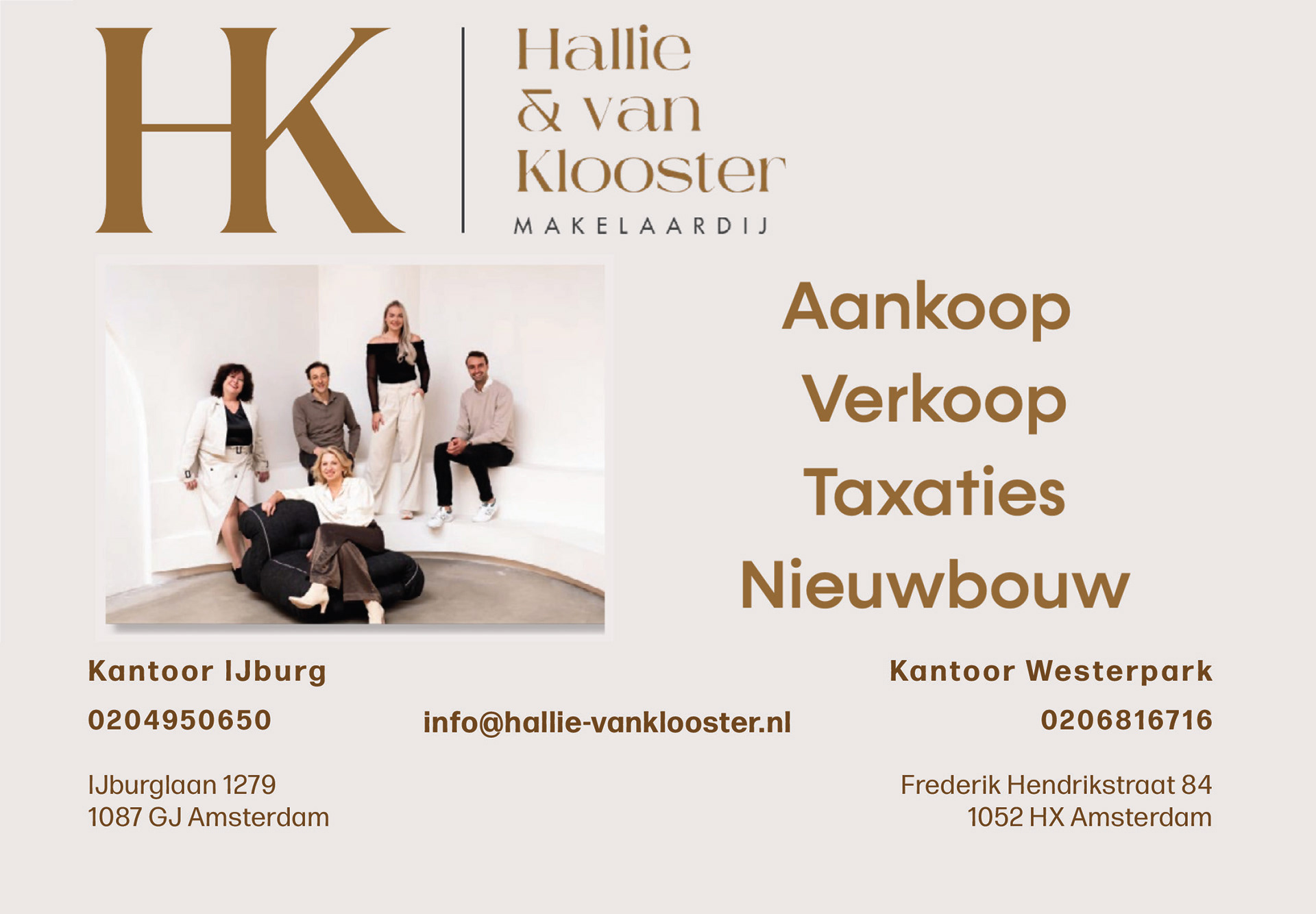
AFTER — Conceptual redesign by TACKA STUDIO A calmer layout with clearer hierarchy, simplified information structure and stronger separation between services and contact detail
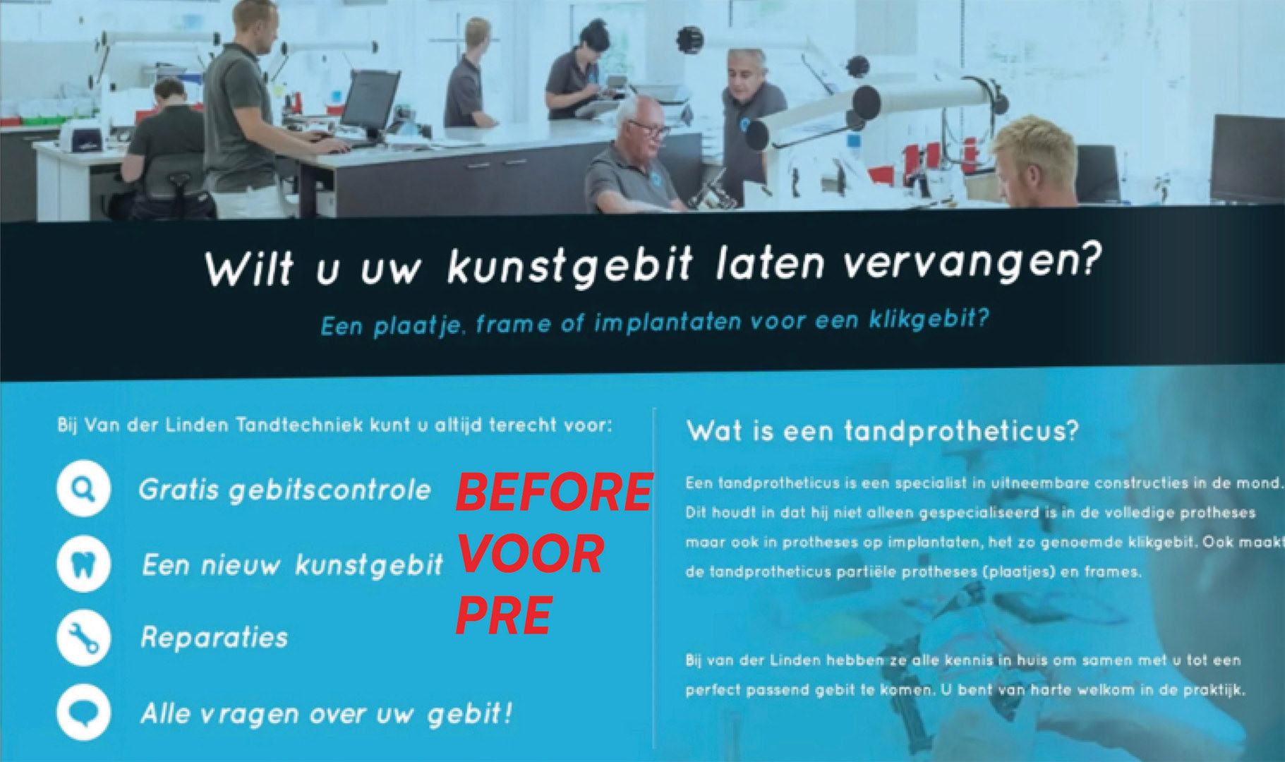
BEFORE — Photo grid showing the original Van der Linden Tandtechniek advertisement before redesign, with small typography, limited contrast and a crowded layout.Photo grid showing the original Van der Linden Tandtechniek advertisement before redesign, with small typography, limited contrast and a crowded layout.
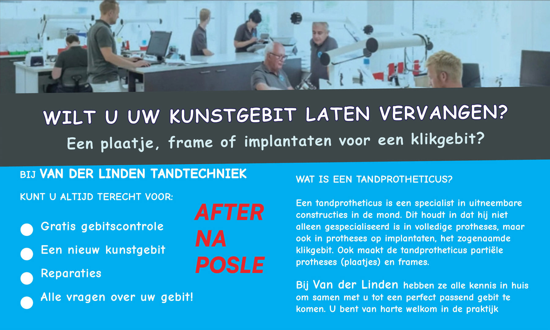
AFTER— Dental technology advertisement — conceptual redesign.Photo grid showing the conceptual redesign of the Van der Linden Tandtechniek advertisement, with improved typography, contrast, white space and information hierarchy.
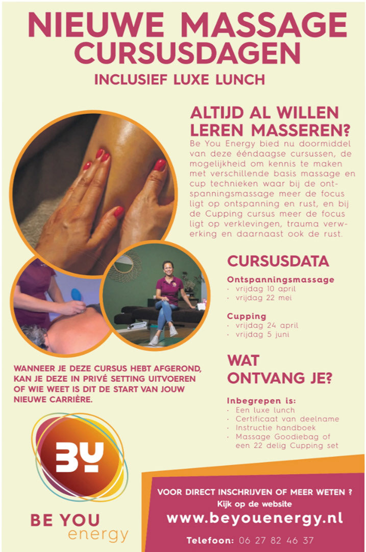
BEFORE — Original advertisement Senioren Krant advertisement — original design.Photo grid showing the original advertisement from Senioren Krant before redesign, including its existing typography, colour palette and information structure.
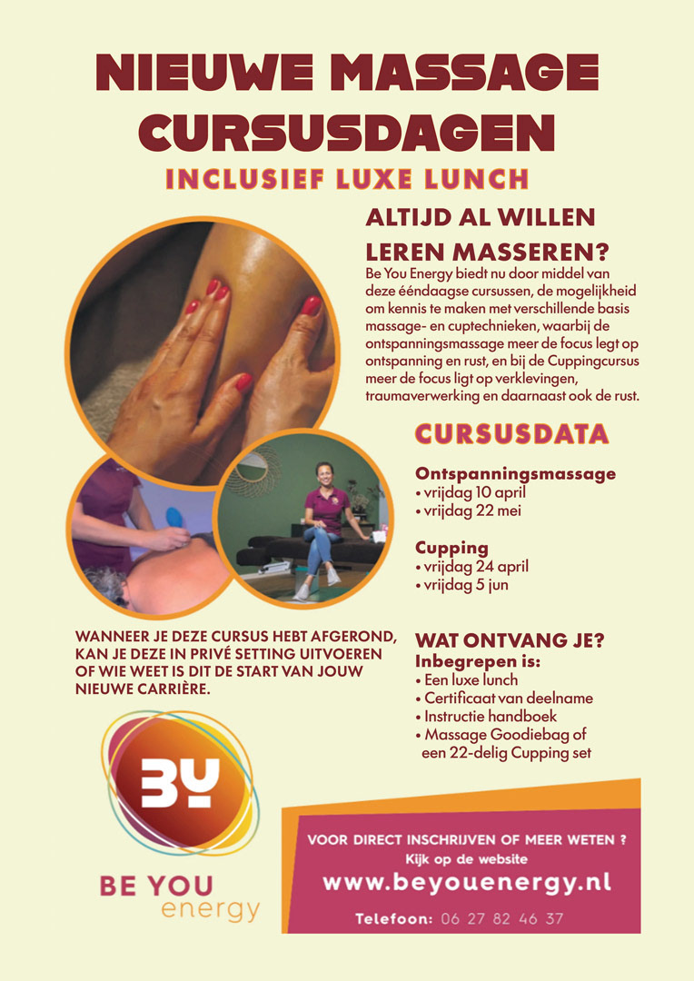
AFTER — Original advertisementSenioren Krant advertisement — conceptual redesign.Photo grid showing the conceptual redesign of a Senioren Krant advertisement for active 50+ readers, with clearer hierarchy, stronger contrast and balanced white space.
CONCEPTUAL REDESIGNS FOR ACTIVE 50+ AUDIENCES
Visual Communication · Before & After
This series of self-initiated design studies explores how existing advertisements and campaign visuals can be made clearer, more coherent and more contemporary for active people aged 50 and over.
For each redesign, I used the original message and recognisable visual elements as a starting point. I then explored how typography, contrast, colour, white space and information hierarchy could improve the communication while preserving its original identity.
The purpose was not simply to make the text larger. The studies consider how design can better reflect an audience with experience, developed visual taste and ambitions for the future—without relying on outdated stereotypes about age.
DESIGN APPROACH
• Analysis of the original communication
• Improvement of typography and readability
• Stronger contrast and information hierarchy
• More consistent use of colour and white space
• Preservation of the original message and recognisable identity
• Contemporary presentation without age-related stereotypes
• Improvement of typography and readability
• Stronger contrast and information hierarchy
• More consistent use of colour and white space
• Preservation of the original message and recognisable identity
• Contemporary presentation without age-related stereotypes
01 — CAMPAIGN POSTERS ABOUT POSITIVE AGEING
The campaign “Je bent nooit te oud om te leven” — “You are never too old to live” — challenges negative representations and persistent assumptions about ageing. The posters feature active and inspiring people aged 50 and over who are fully engaged in life.
For this conceptual design study, I selected three existing campaign posters. While preserving the original photography, campaign message and typographic identity, I explored how the posters could become a more visually coherent series.
A colour field connected to the individual portrait was introduced in each poster. The positioning and treatment of the campaign message were made more consistent, creating a stronger balance between portrait, typography and white space.
CHANGES
• Greater visual coherence across the three posters
• Consistent placement of the campaign message
• Improved balance between photography and typography
• Colour choices adapted to each portrait
• Preservation of the campaign’s original identity
• Consistent placement of the campaign message
• Improved balance between photography and typography
• Colour choices adapted to each portrait
• Preservation of the campaign’s original identity
RESULT
The redesign creates a more unified poster series while keeping the individual portraits at the centre. Colour, composition and typography support the campaign’s positive and energetic message about ageing.
Self-initiated conceptual redesign. SIRE was not the commissioning client.
02 — SENIOREN KRANT ADVERTISEMENT
This design study explores how an existing advertisement can be made clearer, more structured and more comfortable to read for people aged 50 and over.
The original advertisement was selected from the Dutch publication Senioren Krant. For the redesign, I refined the colour palette, strengthened the contrast and improved the typography, white space and information hierarchy.
CHANGES
• Stronger contrast between text and background
• Clearer and more legible typography
• Improved information hierarchy
• More consistent use of white space
• Dates and essential information made easier to scan
• Preservation of the original content and identity
• Clearer and more legible typography
• Improved information hierarchy
• More consistent use of white space
• Dates and essential information made easier to scan
• Preservation of the original content and identity
RESULT
The redesign introduces more clarity, visual balance and structure. Essential information can be found more quickly, and the content is more comfortable to read while the original message remains recognisable.
Self-initiated conceptual redesign. BY YOU energy was not the commissioning client.
03 — DENTAL TECHNOLOGY ADVERTISEMENT
The original advertisement contained a large amount of relevant information. However, limited contrast, small text, multiple typographic styles and a crowded layout made the content difficult to scan.
For the redesign, I retained the original photography, content and recognisable blue colour. I then strengthened the typographic hierarchy, improved the contrast, introduced more white space and reorganised the information.
CHANGES
• Larger and more legible typography
• Stronger contrast between text and background
• Clearer organisation of information
• More white space between individual sections
• Simplified presentation of services
• Preservation of the original photography and visual recognition
• Stronger contrast between text and background
• Clearer organisation of information
• More white space between individual sections
• Simplified presentation of services
• Preservation of the original photography and visual recognition
RESULT
The redesigned advertisement appears calmer, clearer and more professional. The main message, available services and explanation of dental prosthetics can be found and understood more quickly.
04 — REAL ESTATE ADVERTISEMENT
This design study explores how an existing real estate advertisement can be made calmer, clearer and easier to scan while preserving its established visual identity.
For the redesign, I retained the original logo, photography, colour palette and content. I reorganised the information hierarchy, simplified the layout and created clearer separation between the services and the two Amsterdam office locations.
CHANGES
• Clearer information hierarchy
• More structured contact information
• Improved balance between image and typography
• More white space and a calmer composition
• Consistent use of the existing brand colours
• Preservation of the original identity and content
• Clearer information hierarchy
• More structured contact information
• Improved balance between image and typography
• More white space and a calmer composition
• Consistent use of the existing brand colours
• Preservation of the original identity and content
RESULT
The redesign creates a cleaner and more contemporary advertisement in which the services, office locations and contact details can be identified more quickly, while maintaining the recognisable character of the original brand.
The redesign creates a cleaner and more contemporary advertisement in which the services, office locations and contact details can be identified more quickly, while maintaining the recognisable character of the original brand.
Self-initiated conceptual redesign. Hallie & van Klooster Makelaardij was not the commissioning client.
05 — HOTEL ADVERTISEMENT
The original Hotel Jakarta advertisement uses a strong and recognisable brand identity, but the contact information is presented in two long lines, making individual details less easy to scan quickly.
For this conceptual redesign, I retained the original logo, content and green visual identity. I reorganised the contact information into separate lines, adjusted the typography and spacing, and introduced a brighter green to give the advertisement greater visual presence within a newspaper environment.
CHANGES
• Clearer organisation of contact information
• Improved typographic hierarchy
• More space between individual information levels
• Contact details made easier to scan
• Stronger visual presence through colour
• Preservation of the original brand identity and content
RESULT
The redesign creates a more structured and visually distinctive advertisement. The address, telephone number and website can be identified more quickly, while the recognisable identity of Hotel Jakarta remains at the centre of the design.
Self-initiated conceptual redesign. Hotel Jakarta was not the commissioning client.
CONCLUSION
These conceptual design studies demonstrate how focused changes in typography, colour, contrast, composition and white space can make existing communication clearer, more structured and more engaging.
Design for active 50+ audiences does not need to feel traditional, cautious or visually simplified. It can remain expressive, contemporary and visually distinctive while respecting the audience’s experience, intelligence and developed sense of design.
Across different sectors and types of communication, the same principle applies: clearer communication does not mean less character. Good design can combine clarity, recognition and visual impact.
DISCLAIMER
These are independent, self-initiated conceptual redesigns created exclusively for portfolio purposes. The projects were not commissioned by and have no official affiliation with SIRE, Nationaal Ouderenfonds, Senioren Krant, Be You Energy, Van der Linden Tandtechniek, Hallie & van Klooster Makelaardij, Hotel Jakarta Amsterdam, WestCord Hotels, or the original designers and advertisers.
All original brand names, logos, photography, written content and campaign elements remain the property of their respective rights holders. They are shown here solely as context for the conceptual before-and-after design studies.
Conceptual redesign and presentation: TACKA STUDIO · Amsterdam